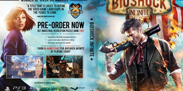
Announced just a few days before the holiday as some sort of present, Irrational Games has proven that when the majority of us (62%) cannot coordinate our voting efforts, the remaining 38% of people who have bad taste can steal victory. In the wake of a recent “controversy” over the cover art to be featured for Bioshock Infinite, gamers were all given an opportunity to vote on the alternate art to be printed on the inside back of the retail version. Given multiple options, this is the winner/what most people agreed on:
Did you notice the red in the above image? Thatâs quite the attention getter — in fact, red and yellow are the two colors in the world that stimulate the most activity in the brain when viewed. (Lots of people point to this fact as at least one of the primary reasons McDonalds is so successful in its marketing — and itâs also the reason matadors use red capes.) For some, this amount of red might even be considered a little too much stimulation. Ultimately, whether you like the color of the alternate cover or not (and whether that comes down to the structure of your own individual brain), how do you feel about the hand drawn art style? Certainly unique, a solid argument could be made that what it communicates to the viewer is that the contents of the box, much like the cover, are perhaps a bit unpolished, unrefined, or unfinished.
As we know that not to be the case, it raises the question of what we, the split majority (the 62% who did NOT vote for this cover) were thinking in making another choice. For my part, in reference to the gallery below which includes all of the images which didnât make the cut, I took the stance that because the relationship between the protagonist Booker and the girl Elizabeth (which he was sent to Columbia to save) plays such a large part in the narrative, then it should somehow be featured on the cover, in the same vein of communicating to the viewer what the contents of the game are all about. Without her there, then it really is a valid criticism of the chosen box art to say that it looks “just like” many of the other stock shooters on the market — which Bioshock decidedly isnât.
The idea that more people voted for cover art that didnât win than voted for the specific victor is intriguing enough in and of itself — if the desire was to please the fans, then havenât Irrational Games now firmly established that there are more people who donât want the red cover than there are who do? (For a better look at how the votes were divided, follow this link to the original blog page where the vote took place.) All that still leaves the ultimate question, which only you have the power to answer: if you were part of the 38% (whose choice 62% of us clearly donât understand) then what compelled you? And if you were part of the 89% who disagree with my choice (I went with #3) then what drew you to your decisions? Leave a comment below and help us understand.


Sorry but this is a really silly argument. The most popular design won. I didnât vote for that design either but this is a very negative article. Iâd argue we should thank IG for giving us a number of options to consider. This just seems like a pointless argument and article.